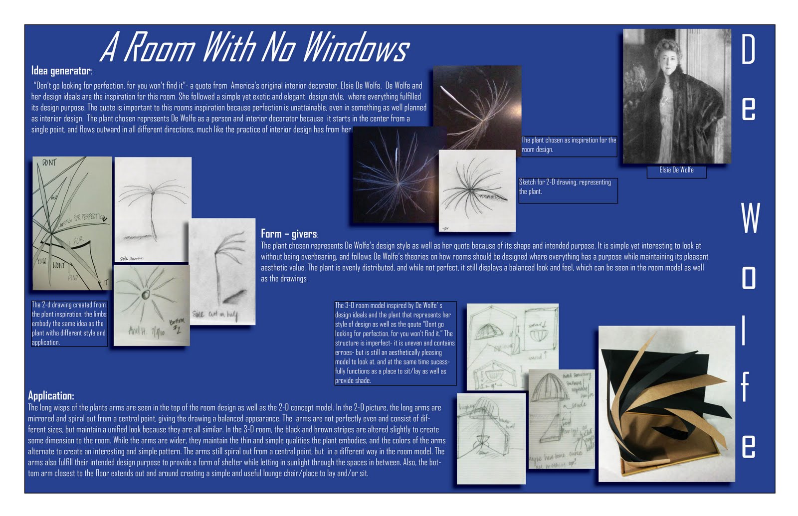
 These are the final poster boards we created for ID 103, summer 2010. these boards are a culmination of the entire class, and all the projects that we have been doing. The boards explain my concept statement, they explain Elsie De Wolfe, my chosen designer and inspiration for this project, as well as features my 3-D room model and a few drawings I did of it. I think that the board turned out well, I think next time i would like to have more color to emphasize certain aspects of the board to add some variety and contrast. i chose to use three boards, and i did because i wanted the pictures to be big enough to see well- and I think that turned out nicely. This project took six weeks total, and I loved doing every part of it! It was definitely a lot of work, but it has turned out to be well worth it.
Thursday, July 29, 2010
These are the final poster boards we created for ID 103, summer 2010. these boards are a culmination of the entire class, and all the projects that we have been doing. The boards explain my concept statement, they explain Elsie De Wolfe, my chosen designer and inspiration for this project, as well as features my 3-D room model and a few drawings I did of it. I think that the board turned out well, I think next time i would like to have more color to emphasize certain aspects of the board to add some variety and contrast. i chose to use three boards, and i did because i wanted the pictures to be big enough to see well- and I think that turned out nicely. This project took six weeks total, and I loved doing every part of it! It was definitely a lot of work, but it has turned out to be well worth it.
Monday, July 26, 2010
Table Sketch
 This was a table I drew while sitting at Starbucks one morning. It is not exact, but the table I drew was inspired by the Starbucks table. This was a fun drawing because we had just learned how to draw furniture using a cube and the horizon line and vanishing points as guidelines. I like this drawing because it looks very precise, the edges are pretty straight and crisp, and it looks nice. In a drawing that is more than a rough sketch, I would create straighter lines with better respect to the horizon line and vanishing points.
Room Sketch #2
 This is the second drawing of Michele's living room, it is also 2-point perspective, but from a slightly different angle with different furniture. I feel I did a better job of creating the illusion of space in this sketch because of the positioning and size of the furniture/front door.
Outside Building Sketch
 This is the very first sketch we did in summer school, as a start to the sketch book we will be working on each week. It is a 2-point perspective of a building across the street from our class room. We all went outside for this, and drew the building. It was a challenging building to draw because it is not level, it is built on the side of a hill so it is built so that when your standing on the hill, the building is level with the ground. I drew some vegetation around the building to add some interest, and shaded areas of both the building and the surrounding bushes to add some dimension.
Room Sketch #1

This sketch is of my friend Michele's living room, I drew it in 2-point perspective with two vanishing points. I would like it to have more depth than what is pictured, but it is a rough sketch, and i think it turned out pretty well.
Textile Pattern

This picture was a very stressful, yet fun project to work on. The assignment was to create a quilt pattern using at least six images that we found on the internet, then changed in photo shop,then arranged in a quilt-like pattern. I used six different images, and changed aspects such as the color and the texture, and enlarged some so that it was completely different than the original image. I then cropped and rotated each image so that it fit perfectly on the quilt template I picked out. It was surprisingly hard to align all of the images properly without any gaps or overlay, and it took a considerable amount of time. I wanted the quilt pattern to be bright and colorful, which I feel I achieved pretty well. I don't like how dark the center image turned out, it was originally a picture of Dwayne "The Rock" Johnson's tribal tattoos on his arm, and when I enlarged the image it created a really interesting pattern that I wish had shown up more. In regards to the finished quilt pattern, I like how busy and bright it is, its a fun poster.
A Desk Sketch
 Here is a sketch I did of a table in the interior design classroom, it is done in 2-point perspective. I showed dimension and texture by shading and hatching certain areas of the desk and its legs, as well as add its dimensions.
Value and Hatching
 This is a sketch I did with cross-hatching and shading. I did a few different shapes, and experimented different values and areas of shading using hatching to give the shapes a 3-D look.

Subscribe to:
Posts (Atom)