
Friday, December 17, 2010


Monday, November 8, 2010
Wheelchair Experience


This was an assignment we had for studio where my partner and I went around to various places on campus- in a wheelchair- to experience some of the problems people in wheelchairs deal with. I thought this was very fun, it was definitely tiring and at times frustrating, but it really helped me to understand some of the problems people face. Some issues I ran into were trying to find an entrance into a building without stairs, trying to wheel myself up a hill, and we had considerable trouble trying to fit into spaces and around corners. A lot of the spaces were way too small, and we could not get into them- such as bathroom stalls. Not being able to fit into spaces or down hallways showed the importance of universal design-because there are many people in chairs that need to access everything that someone who's not in a chair does. Universal design is very relevant and very important, and being in a wheelchair for that small amount of time was helpful. I have a better understanding of the needs and limitations that can be eliminated with proper and thoughtful design.
Master Bathroom process work

This is the book that I put together of all of the process work in creating the bathroom. The process work is very helpful when designing, and it definitely takes a lot of brainstorming and sketching to come to the "final" product. With the packet, its convenient to have because when I'm revising the design, I can go back and look at work that I've already done and see what I did well, and what needs to be fixed for the final product.
Master Bathroom Sketch Model
 This is a light study model of the master bathroom made from foam board. It shows how light hits the room, and highlights the areas where more/better lighting will be needed depending on the time of day, placement of walls, etc. I had been using note card paper to create previous study models, and they never turned out as well as this one. Foam board is a sturdier product- much more difficult to work with of course- but it produces cleaner, more professional looking models, so I will continue to use it. The model is to scale, 1/2"=1'. It is however missing a window on the west, (right) side next to the soaking tub, so I will need to go back and cut that out for the final presentation model.
Master Bathroom Boards

These boards are the finished master bathroom. The boards feature my parti sketch for the room, the final 1/2" = 1' scale floor plan, various elevations, and all of the materials and fixtures. I wanted the bathroom to have a natural looking style, so I incorporated numerous types of stone and metals as well as bamboo plants to help incorporate some outdoor elements inside. The neutral grey concrete flooring helps to bring together all of the colors used, and the back-lit green onyx wall provides a warm glow that highlights all of the colors in the room.
I really enjoyed designing the master bathroom, and I chose to focus on it because it is the most intimate and private bathroom in the house. It calls for special attention, and I feel I put elements into it that gives it a special feel. As far as the way it turned out, I am pleased. Bathrooms were similar to kitchens in respect to all of the specific measurements that are required, and it was challenging getting everything to fit/and or work properly with the necessary codes and NKBA guidelines. For the final bathroom design/display, I thin k I need to work on organization and how things are laid out on the board in order to more effectively communicate the ideas and aspects of the room.
Monday, October 25, 2010
 This is my concept model for the entire Gregory home that we are designing. This model represents how I feel home is. It is chaotic, and busy, full of energy and people, and always changing. A home to me is not a place, but more of a feeling, and it is all dependent on the family that occupies a residence. The yellow and white pieces represent these concepts, and the blue wire swirling around it represents the feeling of "togetherness" that surrounds the, at times chaotic, home. The colors are also representational of aspects of San Diego where I grew up. The yellow pieces are similar to the sun, and the blue is like the waves of the ocean.


 This is one angle of the finished twins room project. I wanted to have the finished project displayed in a fun and energetic manner, and I thought a 3-d representation of all of the aspects of the room did just that. This angle is of the floor plan, a rendered perspective of one of the walls of storage, and paint samples of the wall and soffet colors in the room.


These are preliminary parti sketches of the kitchen we are designing in studio. I did tons of drawings for this room because there are so many aspects of a kitchen that need attention. These sketches in particular are of measurements of cabinets, cook tops, sinks, refrigerators, etc. It was a lot of work researching all of the proper dimensions of everything that goes into a kitchen, but very fun at the same time.


Kitchen Design
 This is the "final" board for the kitchen. We will be finalizing certain details in the final project, but for now this is what the kitchen looks like. The materials I chose to use are cement flooring with radiant heating, and bamboo cabinetry with granite counter tops. The walls are a golden yellow textured vinyl, with a bright blue tile back-splash. The hardware, cook top and sinks are all stainless steel, and the retractable glass window around the bar will serve as a way to close off certain parts of the house to make it more private when necessary. The entire kitchen is wheelchair accessible, as well as suitable for universal design, meaning it is able to be easily used by multiple generations, including those with disabilities. The kitchen was a lot of work, more than expected, but it was extremely fun to learn about and create.
Thursday, July 29, 2010
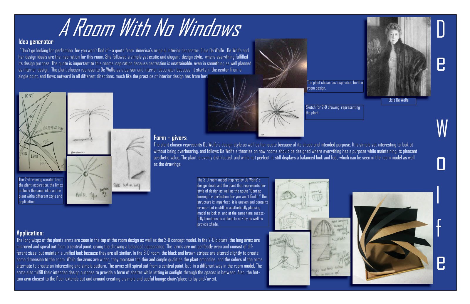
 These are the final poster boards we created for ID 103, summer 2010. these boards are a culmination of the entire class, and all the projects that we have been doing. The boards explain my concept statement, they explain Elsie De Wolfe, my chosen designer and inspiration for this project, as well as features my 3-D room model and a few drawings I did of it. I think that the board turned out well, I think next time i would like to have more color to emphasize certain aspects of the board to add some variety and contrast. i chose to use three boards, and i did because i wanted the pictures to be big enough to see well- and I think that turned out nicely. This project took six weeks total, and I loved doing every part of it! It was definitely a lot of work, but it has turned out to be well worth it.
Monday, July 26, 2010
Table Sketch
 This was a table I drew while sitting at Starbucks one morning. It is not exact, but the table I drew was inspired by the Starbucks table. This was a fun drawing because we had just learned how to draw furniture using a cube and the horizon line and vanishing points as guidelines. I like this drawing because it looks very precise, the edges are pretty straight and crisp, and it looks nice. In a drawing that is more than a rough sketch, I would create straighter lines with better respect to the horizon line and vanishing points.
Room Sketch #2
 This is the second drawing of Michele's living room, it is also 2-point perspective, but from a slightly different angle with different furniture. I feel I did a better job of creating the illusion of space in this sketch because of the positioning and size of the furniture/front door.
Outside Building Sketch
 This is the very first sketch we did in summer school, as a start to the sketch book we will be working on each week. It is a 2-point perspective of a building across the street from our class room. We all went outside for this, and drew the building. It was a challenging building to draw because it is not level, it is built on the side of a hill so it is built so that when your standing on the hill, the building is level with the ground. I drew some vegetation around the building to add some interest, and shaded areas of both the building and the surrounding bushes to add some dimension.
Room Sketch #1

This sketch is of my friend Michele's living room, I drew it in 2-point perspective with two vanishing points. I would like it to have more depth than what is pictured, but it is a rough sketch, and i think it turned out pretty well.
Textile Pattern

This picture was a very stressful, yet fun project to work on. The assignment was to create a quilt pattern using at least six images that we found on the internet, then changed in photo shop,then arranged in a quilt-like pattern. I used six different images, and changed aspects such as the color and the texture, and enlarged some so that it was completely different than the original image. I then cropped and rotated each image so that it fit perfectly on the quilt template I picked out. It was surprisingly hard to align all of the images properly without any gaps or overlay, and it took a considerable amount of time. I wanted the quilt pattern to be bright and colorful, which I feel I achieved pretty well. I don't like how dark the center image turned out, it was originally a picture of Dwayne "The Rock" Johnson's tribal tattoos on his arm, and when I enlarged the image it created a really interesting pattern that I wish had shown up more. In regards to the finished quilt pattern, I like how busy and bright it is, its a fun poster.
A Desk Sketch
 Here is a sketch I did of a table in the interior design classroom, it is done in 2-point perspective. I showed dimension and texture by shading and hatching certain areas of the desk and its legs, as well as add its dimensions.
Value and Hatching
 This is a sketch I did with cross-hatching and shading. I did a few different shapes, and experimented different values and areas of shading using hatching to give the shapes a 3-D look.

Monday, June 28, 2010

Subscribe to:
Posts (Atom)