Ariel's Interior Design Portfolio

Hello, my name is Ariel, and I am currently an interior design major at Washington State University. Interior design is one of my biggest interests, and I plan on making a fun and exciting career out of it. The area that I am most interested in specializing in is ecological sustainability through interior design, while simultaneously maintaining functional and aesthetically pleasing designs. I plan on graduating WSU with a masters degree in interior design, then traveling over the world furthering my career and design experiences.

These are some projects and sketches I did while in summer school 2010. This was the first interior design class I have taken.

Wednesday, May 4, 2011

Beach Retreat

This is a project I completed last semester that turned out very well in my opinion. The purpose was to design a room for a client utilizing fabric samples, a piece of furniture, and a prized possession that they selected. My client chose light fabrics, and furniture with a beach inspired theme, with her prized possession being a collection and love of seashells. To incorporate her love of the beach and shells, I decided to design a beach inspired living room, in a little studio along the beach. I incorporated her large overstuffed couch, with a large overstuffed armchair in the opposite corner with a blue and white nautical themed pattern, complete with white rope trim. Keeping in mind the amount of sand/water that accompanies a house along the beach, I used a concrete floor with a sand motif in order to help keep the house cool as well as clean, as well as to create a more seamless distinction between outdoors and indoors. To help bring the outdoors in, I decided to use large windows with a teak wood trim that allow plenty of light into the room as well as magnificent views of the water. To incorporate her seashells, I designed a sand wall, that helps to separate the entrance from the living room. The wall is made of glass, with teak wood case, that is filled with sand and shells. The case is also lit from the top with recessed ceiling lights that helps to highlight it as a point of interest and intrigue. When I presented the room to my client, she was ecstatic. She loved the furniture, the windows, the lighting, and especially the sand wall. I am very pleased with the outcome of the design, and it is actually of my favorites Ive done.

Process

These are samples of the many process pieces of work I did for the depot design. I did them all on trace, because trace paper is easy to maneuver and makes a great overlay. Included in my design process I experimented with numerous floor plans to decide on the best option for the hotel. Along with drawing and redrawing plans, I sketched what the room would look like along side the plan to get a better 2-d representation of the room. I think sketching up what the spaces would look like was extremely helpful in visualizing the space more clearly and in a different way. Looking at plan views is always good, but being able to bring that space up into a different view helped me make a lot of decisions and I was able to better see how things would/would not work. Along with sketching and plan views, I created numerous blocking diagrams and bubble diagrams to help myself in space planning and adjacencies. These are helpful because they help me to see the relationship between rooms and how spaces should fit together in order to make a more realistic and functional design. All of these elements combined helped me to make a design and floor plan I was very pleased with, and I enjoyed doing it.


Final concept model


This is the final concept model I designed to represent the concept of the depot. It originated from the Southern Cross Train Depot in Melbourne, Australia. The ceiling in the Southern Cross Train depot is a series of squares tied together to form a curving pattern/motion, so I tried to mirror that idea with my model in an abstract way. My model features square panels that link together that flow into a curving pattern, similar to Southern cross. I wanted to incorporate my ideas for the hotel into the model as well, so I had the squares curve off into the distance, symbolizing guests' stay at the hotel, as well as representing my artists work. I want the stay in the hotel to be a surreal experience, where guests could get lost in the design of the hotel. My artist, Aaron Reed's photography has the same feeling. The way his pictures develop is almost unreal, which is what I wanted to incorporate into the design of the model. It curves in an unrealistic and playful manner, which is exactly the idea intended for my depot design.

Depot Boards

These are the final boards I made to showcase the final depot design. I am actually not very pleased with the outcome of them. One thing I realized now that I see the boards complete is that I need a lot of improvement on putting my designs together. I have a good idea for designs, but putting them all together is something I definitely struggle with. Some things I am noticing that will help to make the boards better is to put the materials that correspond with certain rooms on the actual board, it will help people viewing the boards to better understand and visualize the way the rooms will look, as well as create a more visually appealing presentation. Another problem I see is with the orientation of the boards. I originally thought that switching them different ways would be interesting, but it turned out that it just looked messy and slightly disorganized. It did not help in the actual presentation either. So, next time I create boards, I will be sure to keep all of these things in mind so that I will create a better presentation next time.

As far as the hotel design goes, I love the way it turned out. I feel I incorporated the artists concept and work very well and consistently throughout the hotel, with lighting and materials that reflect the glowing nature of his photographs, and that help to create a surreal experience. I tried to incorporate his work in more than just pictures, so to do that I took elements from his work such as the glowing effect and stark contrast 0f colors in materials and lights, as well as giant fiber optic moving/glowing photos in each room. To bring his work to a 3-d level, I took elements from certain photos and made them structural aspects of the hotel, such as cables from photos of bridges used to anchor the curved headboard structures to the ceiling, and LED lights hanging from the ceiling covered in a thin curtain to create a a life like representation of another one of his photos. To incorporate my textile design into the hotel, I created light panels in different sections of the hotel and residence, to further mirror my design as well as artists concept/work. To incorporate my concept model and the Southern Cross inspiration ceiling, I created custom designed headboards that curve and wave to create a more interesting approach to a bed. In conclusion, I feel that the art hotel turned out very well, and I am very pleased with what I designed. The things that I need to work on will improve over time, I will make sure of it. Mistakes help greatly in learning and moving forward in the design process, and i am excited for my next project!


Tuesday, April 19, 2011

Boyer Park Poster

These are final posters my group and I did for a remodel of the Boyer Park event space located outside of Pullman. To start the project, we met with the managers and asked them questions about what they wanted to do with the space. It is just a big open room that had been walled in to protect visitors from the wind, so we had a wide variety of things we could have done. Actually talking with the clients and finding out what they want for their space was not only fun, but extremely helpful in narrowing down options we had come up with, as well as excellent practice for when we have real clients. The couple was very nice, and easy to talk to.

Working in a group is always a challenge, and it is something I'm very glad we are doing. It forces us to work together to find design solutions that best fits the clients needs, and again, it was great practice for when we actually work. Our team worked together extremely well, and we decided to leave the existing concrete floor, and give it an acid stain treatment to cut down on material cost, and to help with sustainability issues. As for the wall. we removed most of the west wall facing the lake and replaced it with Nanawalls, which are giant window wall doors that can be opened out to the new deck we built, leaving the inside and outside spaces less distinguishable. The managers really liked the natural atmosphere, so on the wall opposite the Nanawalls we decided to add a stone veneer over the entire wall to bring more of the natural element indoors, as well as to add aesthetic value and texture. The rest of the walls were just painted a pleasant neutral beige and the furniture would be tables they could move around/ add at their leisure. Overall I'm very pleased with the space and I'm very glad we had the opportunity to work on it.


Textile Reflection

This is an image of the final textile pattern that I chose to turn into a fabric to be used for my art hotel. I love the pattern and the flow of the fabric, and it embodies the Australian train station beautifully. Choosing a color scheme turned out to be a challenge because the pattern is a bit intense, and many colors were too much for this, so I went with neutral brown/ beige colors that contrats nicely against the black in the back ground. What I dont like about the design is the middle square section. it looks odd because its so plain and a little awkward compared to the rest of the design, and I would like to eliminate that part and just join the pattern together in the middle to create one whole piece. A feature that I have grown to like is the lines that separate the squares/ modules. At first I really didn't like them and I tried to eliminate them, but the way the pattern lined up wouldn't allow me to get rid of them fully, and now that I see them in full context I think it adds interest. This was definitely a learning experience on pattern and design, and the next time I make a fabric I will have better ideas about what aspects work and what doesn't.

Blind Experience

I don't have any pictures describing this posting, but I think the one above works perfectly to illustrate what I experienced. At the start of the semester, a partner and I took turns walking around the WSU bookstore wearing a pair of sunglasses with the lenses covered in Vaseline to simulate the visual/tactile experiences of someone who is blind/ partially blind. Since we are designing a hotel who's manager is legally blind, this was a great thing for us to do. Looking through the glasses was very similar to the picture above, where most object were fuzzy blurs, and the source of light indistinguishable. My partner led me around the store, up and down stairs and I was able to attempt to use things such as an ATM, or elevator buttons with limited visibility. It was challenging, and it made me nervous because I had to rely on someone else to get where I wanted to go. This experience was fun, and it gave me a deeper interest in wanting to learn how to design spaces for people with vision problems. It is something I definitely don't quite understand yet, but doing this allowed me to "see" firsthand some of the problems people with this disability encounter, which in turn helps me design better spaces that help make this problem less significant.

Monday, April 18, 2011

Grandparent's Apartment


This is a sketch-up model of the grandparents residence I designed last semester. I am just learning how to use the program, and for the most part it is pretty easy. I am learning new shortcuts and tools that will make my models look better with practice, but I do like the way this view of the living area from the kitchen turned out. Although it took a lot longer than I expected, I learned a ton of stuff about how sketch-up works including commands and tools that allow me to import pictures/ 3-D models from other places that give the model texture and variety to make it more realistic. For this model, I went online to find manufacturers' pictures of actual materials I had specified for the apartment, and imported the colors and textures into things such as the carpet, and the wood to show how it would actually look in the space. For the furniture, I had more of a conceptual understanding of how it would look, so I used furniture similar to what I planned/envisioned from the warehouse to put into the model. I learned that picking an interesting as well as functional view into the space I'm making in sketch-up is one of the most important factors, and doing that will help show off the space I designed as well as create an interesting picture.

Textile Design


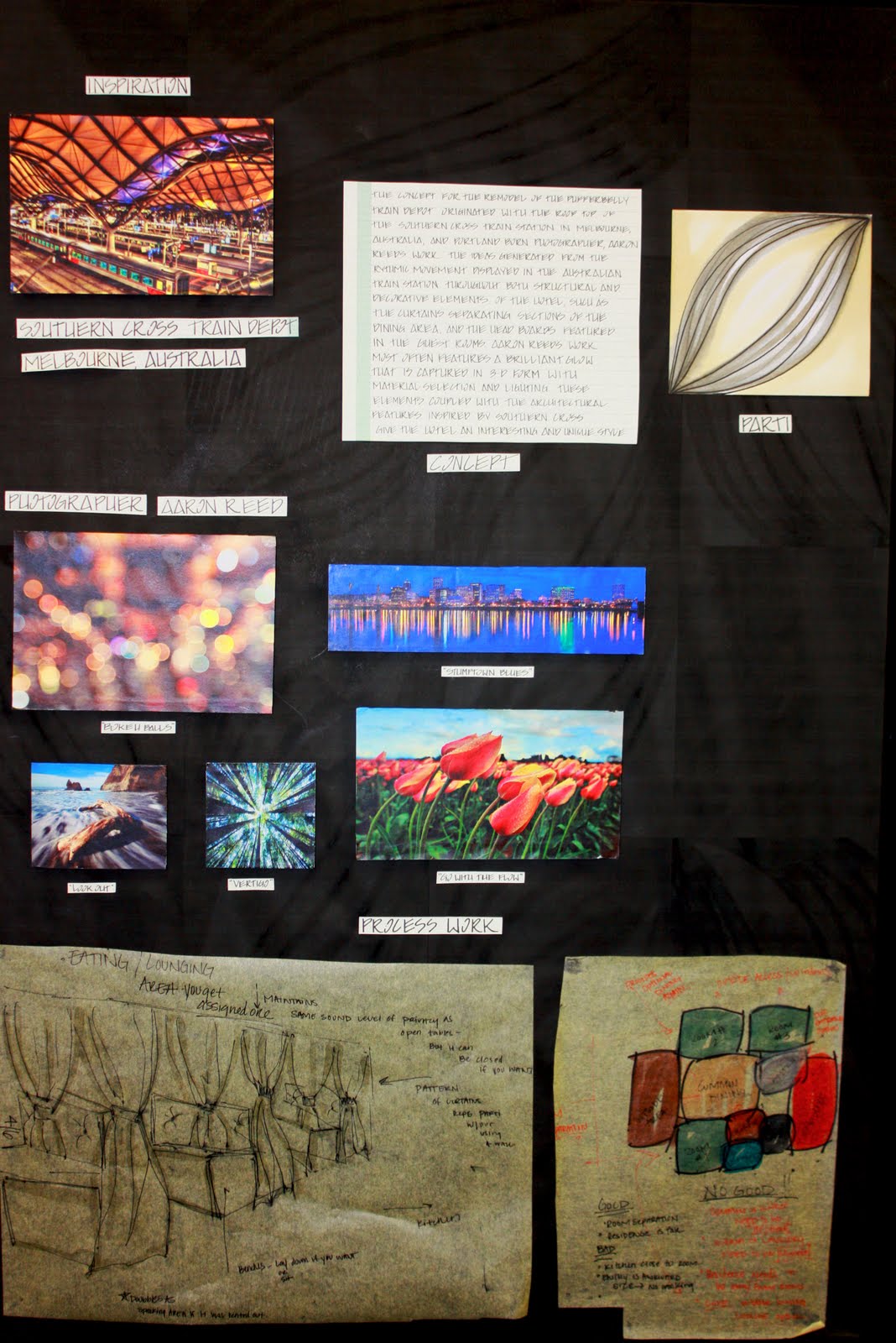
As part of the design process for the art hotel I am designing, I created a book of textile patterns from four original parti drawings based of of a train station ceiling in Melbourne, Australia. The ceiling curves and folds in a really interesting way, and I wanted to show the curves in the textile pattern I made. These are the four different patterns I came up with to represent the train station, and I think they turned out well. They are all very different, but share similar attributes, such as curving lines. I incorporated four different color schemes into each pattern to get a better idea/understanding of how the values and color contstats would work together when turned into an actual fabric. Now that I am looking at them again, I see that I would have really liked to eliminate the straight lines where the repeating patterns come together in order to create a better "flow", but overall I am pleased with the outcome.

Sunday, March 20, 2011

This is a poster I designed to represent the artist I have chosen as inspiration for my art hotel. The artists' name is Aaron Reed, originally from Portland, Or. I enjoy the beautiful photographs full of energy, color and interest that Reed takes, which was the reason I chose him, and I plan to incorporate his artful photographs into both the physical and aesthetic aspects of my bed and breakfast hotel. As far as the design goes, I am pleased with the overall look of the poster. The dark background contrasts the bright photographs very well, and the layout allowed me to display a decent amount of photographs to better show Reed's work. Unfortunately I see now how the white writing is not easy to read, and that could be frustrating for someone trying to gather information from the poster. In the future I will remember how that had a negative impact on the poster's final appearance, and find a different way to convey the written information.

Design Poster

This poster represents The Colonial Revival design style, popular in the early 1900's. I love this style, and I think the poster effectively conveyed how the Colonial Revival period looked. I chose a textured background in a neutral color, common in this particular era, and chose bright, clear photos to represent evidence of the design style. In order to show a wide variety of elements used in this time period, I used photos of lighting, door handles, trim, bedding, and full views into various rooms of houses to provide an in depth look at the revival design style. Since I am designing a modern hotel utilizing aspects of this Colonial style, I tried to find photos showing actual spaces of that time period (the bedroom), as well as more current interpretations of the design to show how I could potentially use them, and how they would look now. I am very pleased with the outcome of the poster.

Habitat for Humanity

These are renderings of my final house design and floor-plan I did for a potential new house to be built for Habitat for Humanity. The concept I developed for the design of the house revolved around ideas of comfort, simplicity, and stability. The budget for the entire project- construction included was $80,000, which posed a great challenge. It was a fantastic experience to develop plans and construction designs for the organization while staying under budget. I had (still have) pretty limited knowledge concerning allocation of funds, costs of materials, etc., and working on this helped me tremendously to get a feel for how operations work, and how I need to go about dealing with budgets. An aspect that was helpful in this project were the necessary guidelines Habitat established. The house needed to be under a certain amount of square footage, and the material selection was previously chosen. These details were helpful to me in designing the house. I was able to focus on spacial arrangements, and planning, which is an area I need much more practice with. As I was discussing the final design with the Habitat representatives, I became aware of problems in the design relating to proper spacial allocation, and arrangement of rooms. Some things I learned that will be helpful for future reference were placement/direction of doors to enhance certain rooms, building closets back to back in adjoining rooms to conserve space/ building materials, and universal plumbing walls to cut down on costs and for convenience of installation. Taking all of these aspects into account will absolutely help me create better designs in the future, and I really enjoyed working on this project. It was a great learning experience all around.
Kitchen
Master Bedroom
Bathroom


Final Floor-Plans